16 Haziran 2010 Çarşamba

equatible use

Bilboards should not be placed on the pavement because this arrangement may cause problems for people ,especially blind people.
Stairs are not suitable for people who use wheelchair so there should be slope for them. As seen in the some pictures, there are useless slopes. Furthermore, there should be smooth passages.

flexiblity in use

Most of overpasses has no choice to determine the direction. Their stairs should provide preferences for both sides.

low phisical efforts

Slopes and stairs should not be scarped. There should be smooth passage.

perceptible information

Everyone can easily understand the signs. They  should not cause the confusing. In addition to the traffic lamps, there should be aural warning for people. Signboard should be eye level. The signboard of departure time should be in every stations. Moreover, the plan of the city should be at the busy city centers.

simple and intivitive use

Entrances of malls and business center should be realized easily without any sign.

size and space for approach and use

Telephone boxes should be wider to allow people with children.
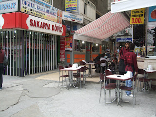
There aren't enough pavement for the pedestrians to walk near the roads.

In bus stops there aren't enough space to allow the passage of both busses and people.
 
 The entrance of the malls are too narrow to  be perceived by people.
 

tolerance for error

The low height of the pavements cause unwanted car parking on them which makes difficult to use pavements by pedestrians.


The turning points are too narrow that can bring about  dangerous situations.


The height of the step is too much to step out for the pedestrians in one step.
Huge stairs on the overpass causes a high physical effort for this reason pedestrians choose the car roads in order to pass the road.
There is a traffic jam which includes the buses, cars an pedestrians.the frequency of bus stops is not appropriate for such a narrow road, causing  disorders in traffic flow.